The Blue Ad of Doom: When Malicious Compliance Meets Graphic Design Nightmares
In the wild world of graphic design, sometimes the customer isn’t just “always right”—they’re the star of their own colorful disaster. Today’s tale, straight from Reddit’s r/MaliciousCompliance, is a masterclass in what happens when a designer is pushed to their creative (and comedic) limits. Spoiler: it involves a single color, a sea of screaming fonts, and the kind of “compliance” that only a true artist can deliver.
What happens when your client’s only creative direction is “less of everything”? Grab your Pantone swatch book and prepare for a tale that’s as cathartic as it is blue.
The Car Ad Circus: Where Good Taste Goes to Die
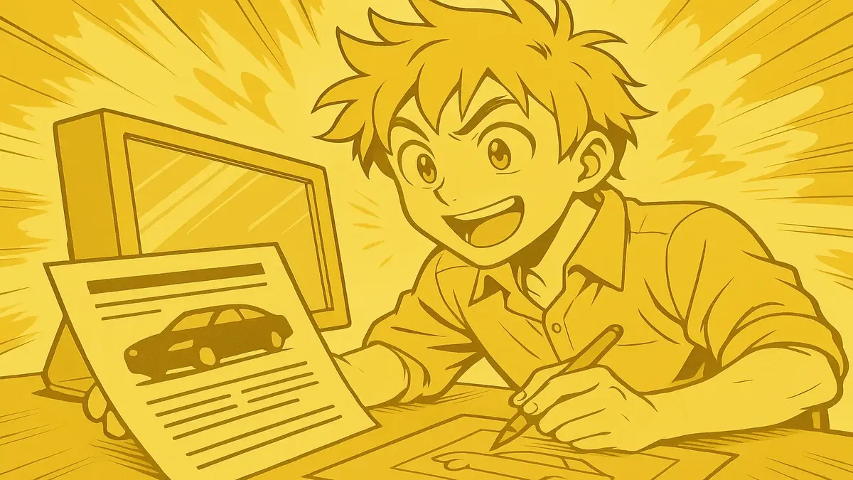
Our story begins with u/Financial_Vehicle134, a fresh-faced graphic designer, eager to inject a little beauty into the world of local print car ads. But if you’ve ever received a mailbox-stuffing car flyer, you know exactly the genre: giant fonts, zero white space, and a grid of cars so dense it looks like a modern art experiment gone wrong.
Out of college and full of ideas, OP quickly learned that creativity was less “appreciated” and more “aggressively rejected.” The clients wanted trash, and trash they would get. One client in particular—the company’s golden goose—had a passion for ads so bad they were almost performance art. Impact font, 100+ cars in a 7x5” space, and color restrictions that would make a minimalist weep.
As OP recounts, “It legit looked like a magic eye poster by the time it went to print.” But the real magic trick was about to come.
One Color to Rule Them All
Things escalated when the client began banning colors. Red? Gone. Orange? Out. Eventually, nearly every hue was on the blacklist, leaving OP with only blue. Taking “malicious compliance” to its logical conclusion, OP dove in: every car, every letter, every element was rendered in the same flat, unshaded blue. The end result? A glorious, featureless blue rectangle—a visual punchline delivered with pixel-perfect precision.
The best part? OP spent hours making sure every requested element was indeed present, just in blue, so when the inevitable client meltdown arrived, they were covered. OP coolly explained, “You told me to use only blue. I used all the elements you asked for and made them blue.” With calls recorded and a boss who couldn’t argue, OP got to savor the sweet satisfaction—and billable hours—of malicious compliance done right.
The community, of course, loved it. As u/intobinto quipped, “That guy really blue himself.” And u/prankerjoker couldn’t resist a little musical homage: “Yo, listen up, here’s an MC story… that wanted a blue little ad… the OP painted everything just blue.”
Designers vs. Clients: A Never-Ending Saga
If you think this story is an isolated incident, think again. The comments section quickly became a therapy group for battle-hardened designers.
One popular thread, started by u/CoderJoe1, shared a tale of a client who couldn’t understand why their website looked “wrong”—until he visited their office and discovered the CEO’s admin was using a monitor set to 16 colors. The kicker? They were an IT company. As u/lewisfrancis replied, “Only to show it to the CEO who used a frickin WebTV to view the internets… they had to redo the whole thing to make it work on the boss's machine.”
Others chimed in with stories of cluelessness and micromanagement, like u/oldmomlady3’s boss who “didn’t like any shape with rounded edges… not even rectangles with rounded edges.” As u/tyleritis summed it up, “It is indeed soul crushing” to be reduced to “just a pair of hands.”
Some stories were just plain sad-funny: u/Clean-Leather932 recalled years of jokes about “CENTER IT BETTER!” after a customer obsessed over a perfectly centered label. And u/Bubblez4 mourned the day a client demanded all marketing go grayscale, then blamed the designers when registration numbers tanked. “It was all so ugly and unattractive but it was all our fault…”
Yet, as u/Hawaiianstylin808 pointed out, “those horrible looking ads worked since you remember them.” Not everyone agreed, though; several commenters shot back that while they remembered the ads, they certainly didn’t remember the brands—or buy the cars.
The True Art of Malicious Compliance
Beyond the laughs, there’s a quiet genius to malicious compliance in the creative fields. As former ad man u/EntranceFeisty8373 noted, “Clients have no idea what they want.” Sometimes, the only way to teach them is to give them exactly what they ask for—blue square, unreadable fonts, and all.
And as OP confirmed in the comments, this wasn’t just a petty move—it was a hard-earned survival strategy. When you’re up against impossible demands, sometimes the only thing left is to have a little fun with it. As for the client? He got his “one color” ad, and OP got a story to last a lifetime.
Conclusion: Commiserate, Create, and Comply (Maliciously)
If you’ve ever worked in design, marketing, or any creative field, you’ve probably met your own “one color only” client. Share your stories in the comments—what’s the wildest request you’ve ever had to comply with? And remember: sometimes, the best revenge is a perfectly executed, utterly ridiculous blue ad.
What color would your malicious compliance ad be? Let us know below, and may your clients be reasonable and your fonts never Impact!
Original Reddit Post: You said you wanted an ad with only one color. You got it buddy!